Which Metrics Should an Energy Analytics Dashboard Track for Factory Energy Management?
An effective energy analytics dashboard should do more than display total electricity use. For factory energy management, it needs to connect energy consumption with production activity, equipment behavior, utility charges, and operational risk. A monthly utility bill can show that spending increased; a useful dashboard should help explain whether the cause was higher output, an avoidable demand peak, idle equipment, compressed-air losses, poor power quality, or a change in tariff conditions.
The most valuable metrics are therefore not identical for every plant. A batch-processing facility, a continuous production line, and a site with energy-intensive heating or cooling will have different priorities. Still, a well-designed dashboard usually needs a small set of metrics that answer four practical questions: How much energy is being used? Where and when is it used? Is the use justified by production? What action should the operations team take?
Start with metrics that explain consumption, not just totals
Total consumption in kilowatt-hours is the basic reference point, but it is rarely enough to manage a factory. It should be visible by day, shift, week, and billing period, with comparisons against a defined baseline. The baseline may be a prior operating period, a target energy budget, or an expected consumption level based on production plans.
However, an increase in kWh is not automatically a problem. If output also increased, the plant may be operating more efficiently than before. Conversely, total consumption can fall while energy performance worsens if production falls faster. This is why total use should appear beside an activity measure such as units produced, tonnes processed, machine-hours, operating hours, or another measure that reflects the site’s real output.
Energy intensity is the operating metric that changes the discussion
Energy intensity links energy to a meaningful production denominator. Examples include kWh per part, kWh per tonne, kWh per batch, or kWh per machine-hour. It is often the first metric that makes energy data useful to production, maintenance, and engineering teams at the same time.
A factory should not apply one intensity metric indiscriminately across every product. Product mix, material grade, line speed, ambient conditions, reject rates, and process settings can all affect normal consumption. If a plant produces both simple and complex products, a single site-wide kWh-per-unit figure can create misleading conclusions. Better dashboards allow users to segment results by product family, line, shift, or process route.
The goal is not to force every variation into a single benchmark. It is to distinguish expected differences from unexplained deterioration. When a line’s energy per unit rises while product specifications and throughput remain stable, that is a credible signal for investigation. Possible causes include wear in mechanical equipment, a misconfigured process parameter, increased scrap, a blocked filter, excessive compressed-air use, or a machine remaining active between jobs.
Track demand peaks separately from energy volume
Electricity volume and maximum demand are related but not interchangeable. A site can consume a reasonable amount of electricity over a day while still creating a brief, expensive demand spike when several large loads start at once. Chillers, compressors, furnaces, pumps, material-handling systems, and charging equipment can create this pattern when their operation is not coordinated.
The dashboard should show the highest demand interval for each billing period, when it occurred, and which areas were operating at that time. It should also display a demand trend rather than only the single maximum value. Repeated morning peaks, shift-change peaks, or restart peaks after planned stoppages point to scheduling issues that may be addressed without changing the process itself.
For a project involving new equipment or production expansion, demand forecasting deserves early attention. An asset may have acceptable annual energy consumption but still require costly electrical infrastructure upgrades because of its coincident peak load. A dashboard that combines historical demand with planned operating schedules provides a more useful planning view than nameplate ratings alone.
Use load profiles to find energy used when no value is being created
A load profile shows how electricity demand changes over time, typically across hours, shifts, days, or non-production periods. It is one of the clearest ways to identify avoidable base load: energy that continues to be consumed when production is reduced or stopped.
Some base load is necessary. Security systems, process controls, refrigeration, server equipment, safety systems, and environmental controls may need to remain active. The concern is the portion that has no operational justification. A factory that has a surprisingly high overnight or weekend demand may have equipment left in standby, air leaks feeding an idle compressed-air network, unnecessary ventilation, or heating and cooling controls that do not follow the production calendar.
Dashboard users should be able to compare normal production periods with shutdown periods and inspect exceptions at an hourly level. A daily total can conceal this problem because a large night-time loss may be diluted by a full day of production. The more variable the production schedule, the more important this time-based view becomes.
Meter the loads that can drive a decision
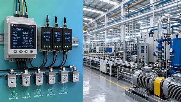
Submetering every small device is usually not a sensible first step. It creates data volume, maintenance work, and dashboard complexity without necessarily improving decisions. Meter the major energy users, the areas with known variability, and the assets connected to planned improvement work.
In many factories, useful submetering boundaries include production lines, compressed-air systems, central cooling or heating plant, major motors, furnaces or ovens, process water systems, and high-load workshops. The right boundary is one where a change in the data can lead to a specific action: repair, scheduling adjustment, process review, maintenance task, equipment replacement assessment, or operator follow-up.
Equipment-level consumption should be read alongside operating status. A compressor drawing power while no downstream demand exists means something different from a compressor drawing the same power during a high-output shift. Where integration is practical, correlate meter data with machine runtime, production count, pressure, temperature, speed, or maintenance status. The dashboard does not need to replace a manufacturing execution system; it needs enough operational context to avoid false alarms.
Compressed air and thermal systems need their own indicators
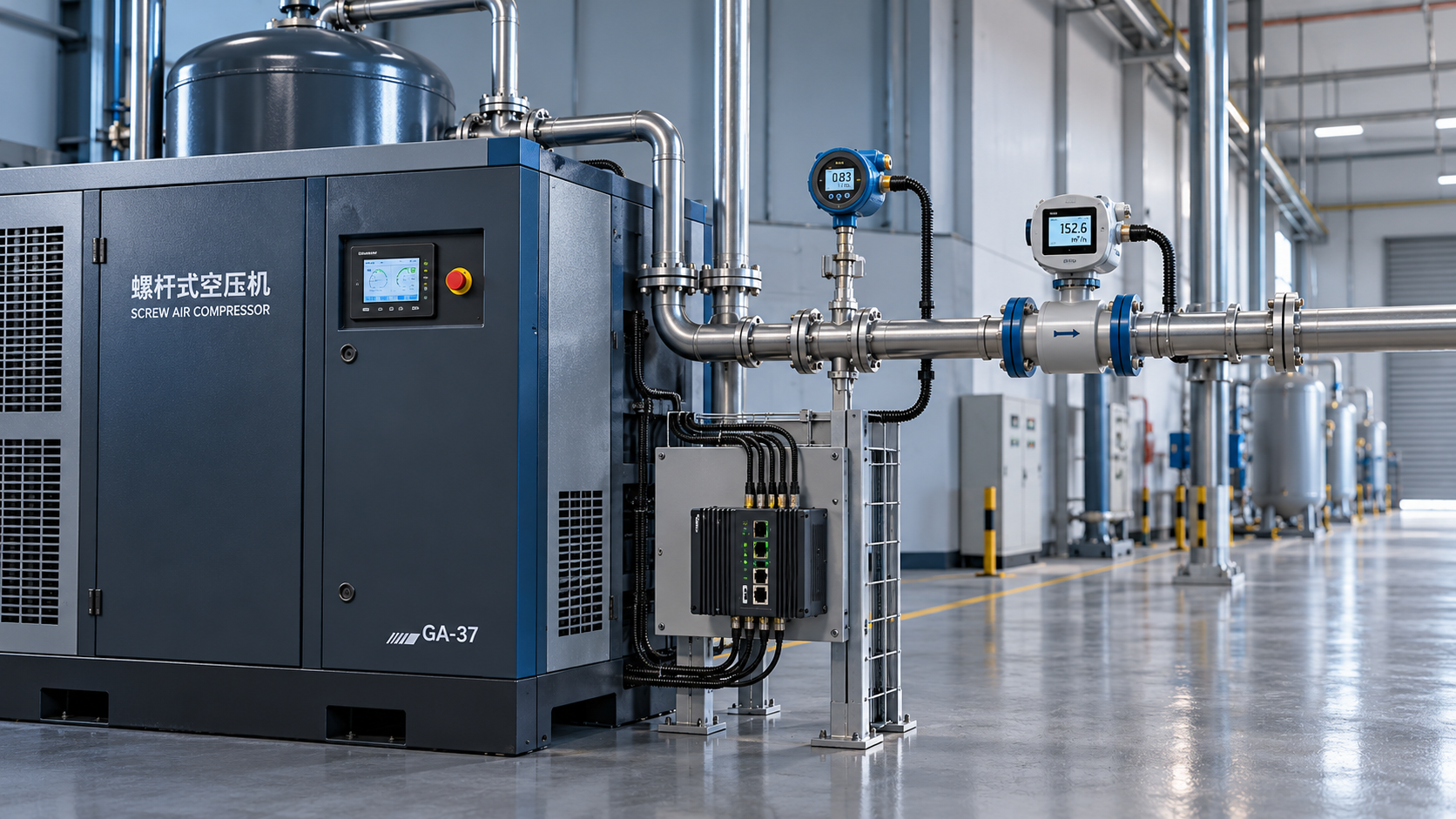
Compressed air is often treated as a general utility cost, yet it can be a significant source of waste when leaks, inappropriate pressure settings, or poor control sequencing are present. In addition to electrical consumption, track compressor runtime, loaded versus unloaded operation where available, network pressure, and consumption during non-production hours. A stable pressure reading does not prove efficient operation; the system may be working harder than necessary to compensate for leakage or poor control.
For heating, cooling, and process thermal systems, energy use should be viewed with relevant process conditions. Outdoor temperature may matter for building cooling, but less so for a process oven. Thermal production loads may be justified by throughput, product quality requirements, warm-up cycles, and heat losses. The dashboard should make these relationships visible instead of treating every increase as an automatic fault.
Make cost visible, but keep cost logic transparent
Energy management decisions are often funded through cost savings, so the dashboard should convert use into a cost view. This is particularly useful when tariffs vary by time, demand level, fuel source, or contractual structure. Cost per unit of output can reveal a financial impact that kWh per unit does not fully capture.
Yet cost metrics can be misleading when the underlying tariff model is hidden. A higher cost may result from a different time-of-use period or a demand event rather than greater consumption. A lower cost may result from tariff timing even while operational efficiency declined. Users should be able to trace cost changes back to consumption, demand, and tariff components rather than treating a single cost figure as a performance score.
For factories using several energy sources, show each source separately before combining them into a total cost view. Electricity, natural gas, purchased steam, diesel, and self-generated energy have different operational roles and different opportunities for control. Combining them too early makes it harder to see whether a project shifted consumption between sources rather than reduced overall energy demand.
Include carbon metrics when they can guide operations or reporting
Carbon indicators are useful when the factory has internal reduction targets, customer reporting requirements, or product-related sustainability decisions. The most practical measures are usually total operational emissions, emissions per unit of output, and emissions by energy source or process area.
Like cost, carbon should retain its connection to source data. An emissions trend is more actionable when users can see whether it came from higher electricity use, greater fuel consumption, lower production output, or a change in the energy mix. It is also important not to treat lower site emissions as proof of lower lifecycle impact if production has simply moved elsewhere in the supply chain.
For exporters and manufacturers working across markets, carbon data is increasingly part of supplier evaluation and customer discussion. Sector-focused intelligence sources such as TradeNexus Pro can be useful for understanding how energy management, clean manufacturing expectations, and supply-chain transparency are shaping commercial requirements. That market context should complement, rather than replace, plant-level measurement.
Build alerts around exceptions that require action
Dashboards often fail because they generate too many alarms. A useful alert is tied to a decision owner and a defined response. Examples include demand approaching a planned threshold, abnormal overnight base load, energy intensity outside the expected range for a product run, prolonged equipment consumption in idle status, or a missing meter data stream.
Thresholds should not be copied from another factory without adjustment. A fixed limit may work for a stable utility system, while a production line with variable product mix may need an expected range based on current orders and operating conditions. Start with a small number of alerts that matter. As the team learns which signals produce valid interventions, the rules can become more refined.
Do not overlook data quality and ownership
Energy data is only useful when meter names, units, timestamps, and production references are reliable. Common problems include duplicate meters, incomplete intervals, mismatched time zones, incorrect multiplication factors, and a production count that does not align with the energy reporting period. A dashboard can look precise while still being wrong in a way that leads to poor project choices.
Assign ownership for each data source and define how missing or abnormal readings are handled. The facilities team may own utility meters, maintenance may own equipment status signals, production may own output data, and finance may own tariff inputs. The dashboard should make those relationships clear instead of leaving one person to interpret every discrepancy alone.
A practical rollout sequence
- Define the decisions the dashboard must support, such as reducing peak demand, validating an equipment upgrade, controlling idle load, or reporting energy intensity.
- Select output measures that fairly represent production activity and separate major product families where necessary.
- Map existing utility and submeter data, then add metering only where it supports a likely action.
- Establish a baseline period and document known changes in production, equipment, operating schedules, and tariffs.
- Launch a focused dashboard with consumption, intensity, demand, load profile, and the most relevant equipment or process indicators.
- Review exceptions regularly, record the reason for each major variation, and use those findings to improve alert rules and investment priorities.
The dashboard is successful when it shortens the path from an energy anomaly to an operational decision. Tracking every available metric is not the objective. A factory needs a defensible view of energy use that explains performance in context, identifies controllable losses, and supports projects with evidence rather than assumptions.
Get weekly intelligence in your inbox.
No noise. No sponsored content. Pure intelligence.
 Oct 24, 2026Tesla Q3 2026 Storage Deployments Rank Second Highest as Revenue Falls 16%Tesla Q3 2026 Storage Deployments Rank Second Highest as Revenue Falls 16%
 Oct 24, 2026Freight Forwarding Services Pricing: Comparing Quotes Beyond Base RatesFreight Forwarding Services Pricing: Comparing Quotes Beyond Base Rates
 Oct 23, 2026IndexBox Issues Off-Grid Solar Outlook to 2035, Forecasting 8.2% CAGRIndexBox Issues Off-Grid Solar Outlook to 2035, Forecasting 8.2% CAGR
 Oct 23, 2026NSF/ANSI 49 Biosafety Cabinets: Product Certification vs. Field TestingNSF/ANSI 49 Biosafety Cabinets: Product Certification vs. Field Testing
 Oct 22, 2026Mitsubishi Electric Develops Industry-First Humanoid Robot–CNC Machining SystemMitsubishi Electric Develops Industry-First Humanoid Robot–CNC Machining System
 Oct 22, 2026Aerospace Aluminum Machining: How to Control Distortion in Thin-Wall PartsAerospace Aluminum Machining: How to Control Distortion in Thin-Wall Parts
 Oct 21, 2026Genesis Energy commissions 200 MWh battery storage system at HuntlyGenesis Energy commissions 200 MWh battery storage system at Huntly
 Oct 21, 2026Buying AMI Smart Meters Wholesale: Compatibility Checks and Total CostsBuying AMI Smart Meters Wholesale: Compatibility Checks and Total Costs
 Oct 20, 2026Werner Enterprises Issues Q3 Earnings Warning as Costs RiseWerner Enterprises Issues Q3 Earnings Warning as Costs Rise
 Oct 20, 2026Are Digital Twins Viable for SMEs? Costs, Use Cases, and Data RequirementsAre Digital Twins Viable for SMEs? Costs, Use Cases, and Data Requirements
 Oct 19, 2026Choosing a Wholesale Servo Motor Exporter: Traceability and Warranty ChecksChoosing a Wholesale Servo Motor Exporter: Traceability and Warranty Checks
 Oct 18, 2026Syringe Manufacturing Equipment: Evaluating Throughput and Assembly AccuracySyringe Manufacturing Equipment: Evaluating Throughput and Assembly Accuracy
 Oct 17, 2026Air Freight Forwarding Services: How to Compare Quotes for Urgent ShipmentsAir Freight Forwarding Services: How to Compare Quotes for Urgent Shipments
 Oct 16, 2026Wholesale Solar Panels: How to Compare Bulk Quotes by Total Landed CostWholesale Solar Panels: How to Compare Bulk Quotes by Total Landed Cost
 Oct 15, 2026Supply Chain Intelligence for Sourcing: How to Vet New SuppliersSupply Chain Intelligence for Sourcing: How to Vet New Suppliers
 Oct 14, 2026How energy costs shape smart manufacturing investment in EuropeHow energy costs shape smart manufacturing investment in Europe
 Oct 14, 2026How skills shortages slow smart manufacturing in Southeast AsiaHow skills shortages slow smart manufacturing in Southeast Asia
 Oct 14, 2026How CNC wire-cut machining maintains tight tolerances in thick partsHow CNC wire-cut machining maintains tight tolerances in thick parts
 Oct 14, 2026Can automated feeding stabilize metal forming in smart factories?Can automated feeding stabilize metal forming in smart factories?
 Oct 14, 2026Can CT inspection detect internal defects in metal additive parts?Can CT inspection detect internal defects in metal additive parts?
 Oct 14, 2026When does additive manufacturing reduce lead time for spare parts?When does additive manufacturing reduce lead time for spare parts?
 Oct 14, 2026How production volume affects ROI on an automated painting lineHow production volume affects ROI on an automated painting line
 Oct 14, 2026What data does manufacturing bottleneck analysis consulting need?What data does manufacturing bottleneck analysis consulting need?
 Oct 14, 2026When should you hire a consultant for manufacturing bottlenecks?When should you hire a consultant for manufacturing bottlenecks?
 Oct 14, 2026What Are Electronics Exporters' Top Supply Chain Resilience Gaps in 2026?What Are Electronics Exporters' Top Supply Chain Resilience Gaps in 2026?
 Oct 14, 2026How Do You Measure AI Adoption Maturity in a Traditional Factory?How Do You Measure AI Adoption Maturity in a Traditional Factory?
 Oct 14, 2026Are Chinese AI-Assisted Surgical Devices Gaining Global Trust?Are Chinese AI-Assisted Surgical Devices Gaining Global Trust?